ワールドトレードセンターの新しいロゴが決まる「the World Trade Center’s New Logo」
9.11のアメリカ同時多発テロで崩壊したワールドトレードセンター跡地に建設中の新ワールドトレードセンターのロゴが決まった。ロゴを作ったのはランドーアソシエイツ。
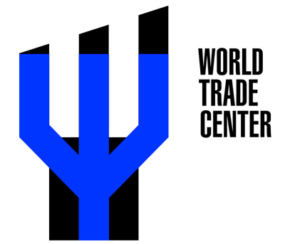
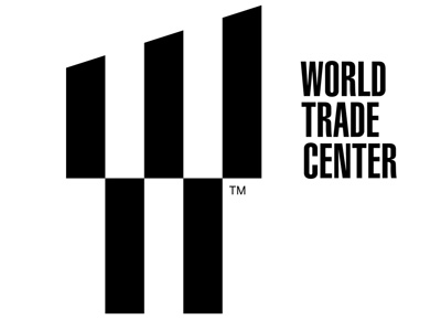
▲ロゴには6つの意味が込められている。一つ目はトライデント。崩落したワールドトレードセンタービルの基礎として使われていた鋼材の形を表している。強さと回復力の象徴。
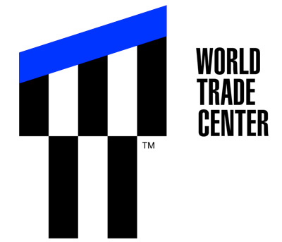
▲上部の17.76度という角度は、新ワールドトレードセンタービルで一番高い1 ワールドトレードセンターの高さ(1776ft)を表す。上昇するイメージも併せ持つ。
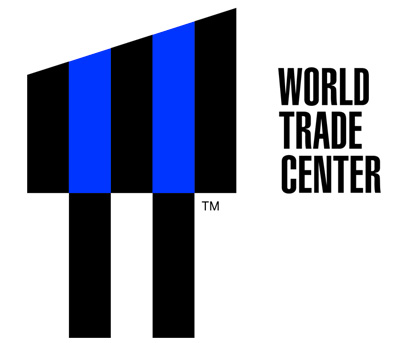
▲Wの中の2つの白いバーで、崩落したツインタワーを表している。メモリアルで行われた光のツインタワーをトリビュートしたもの。
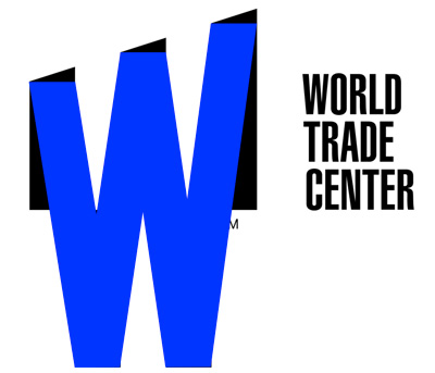
▲新ワールドトレードセンター内の「the World Trade Center」と「the Westfield World Trade Center」の略称としてのW。
▲ツインタワーが建っていた場所に作られたメモリアルパークのプールに映る、ツインタワー。
▲これがちょっと意味不明なんだけど、説明によると「既に16エーカーの土地にWTCタワー7が完成していて、WTCタワー1とWTCタワー4がほぼ完成で、WTCタワー3が建設中、WTCタワー2が計画中となっている」だそう。
→Six Meanings Behind the World Trade Center’s New Logo - businessweek.com
http://www.businessweek.com/articles/......
- 2014-08-20 (水) 8:35
- Logo+CI+marks
- 1 ワールドトレードセンターの一番上からのパノラマを見ることができる「1 World Trade Center: TIME’s View From The Top Of NYC - TIME」
- ゲームで友だちにジュースが贈れるペプシのインタラクティブ自動販売機「Pepsi Interactive Vending - Welcome to the Future of Vending」
- 教習車がポルシェ!スポーツカーの運転を学んでもらうために一番いい方法は?「Taking the driving test in a sports car.」
- 使用したレゴ約50万個!オーストラリア最大のレゴクリスマスツリーができるまでを映したタイムラプス映像
- ニューヨーク公共図書館の集配センターをドローンで空撮した映像「Flying Around Book Ops」